Froghouse was selected in March 2024 to conduct a brand redesign process for METRO Library Council, a network of 140+ libraries in the New York City metropolitan area. Upon completion of the branding project, we were retained to lead a comprehensive redesign and re-architecture of the METRO website.
As a public network of libraries, communal ownership at METRO is both a literal fact and a guiding value. Working alongside the METRO team, we surfaced three themes that speak to the intertwined, composable, and dynamic nature of their work.

Above — a collection of sticky notes from an ethos exploration with the METRO team
METRO connects and amplifies the ideas of their community, celebrating the new perspectives that emerge out of intersectionality. All brand elements—from the logotype to the pattering language—emulate the complementary nature of METRO’s infrastructure.


Like the city it supports, METRO is both structured and amorphous, which frequently creates a sense of multi-directionality.
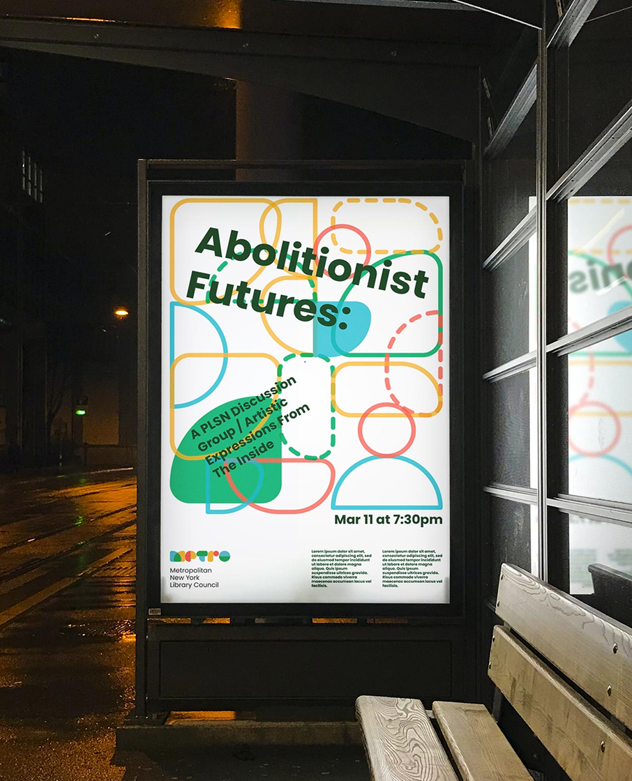
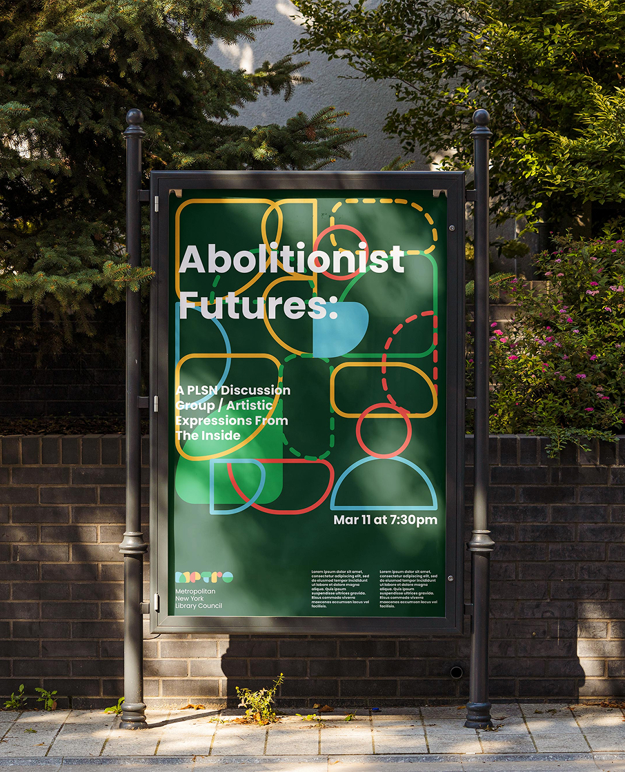
Pulling from the interwoven topology and rich graphic heritage of the MTA maps, the METRO letter forms are composed of modular shapes that invite reconfiguration.


By assembling brand elements according to a set of guidelines, we create the foundation for a generative brand that can create endless expressions of itself in different contexts.
METRO’s strength lies in its ability to provide core services for a diverse set of members while also exploring new directions of librarianship. So how can METRO forge a unique identity while remaining representative and inclusive of its many constituents?

The homepage collage showcases many of the principles we followed in order to create a vibrant and inclusive brand: simplifying messaging around storytelling, embracing candid photography, and showcasing a diverse range of people, places, projects, and ideas.
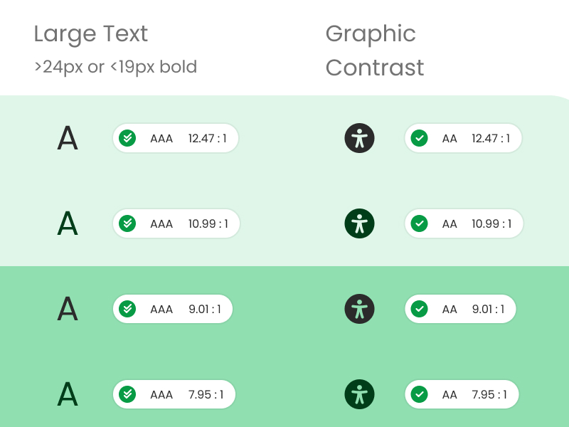
The extended color palette features five shades of each color, providing opportunity to maximize contrast across print and digital formats.
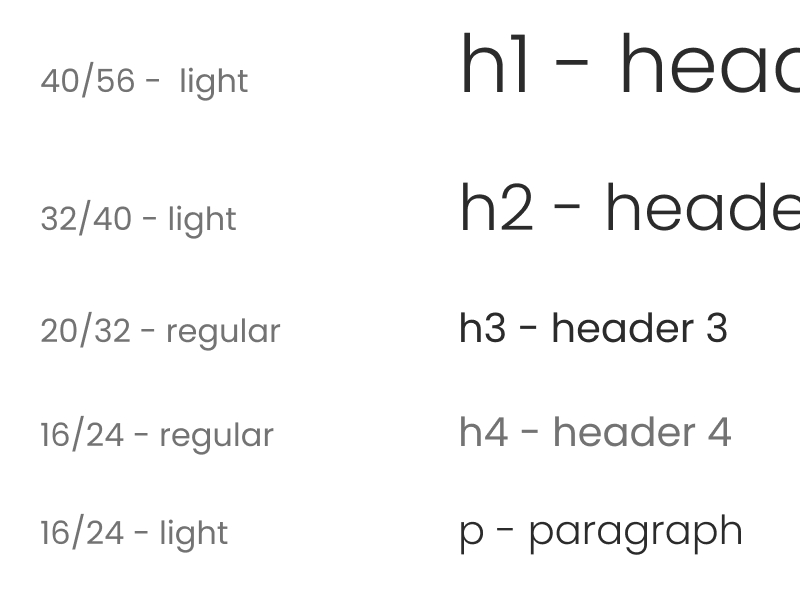
We choose Poppins for METRO’s brand typeface for its legibility and to complement the geometric logotype. Typographic size standards were established based on accessibility best practices.
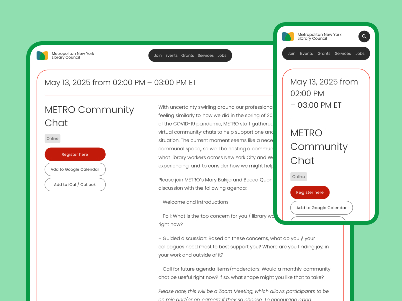
The site is fully responsive, ensuring usability and coherence across devices.
Through an extensive co-design process with the METRO team, we composed a tech stack for the new website that builds on workflows and services that the METRO team uses on a daily basis.
To ensure content is easy to maintain, content databases were designed to ensure a single source of truth: when staff make a change in one place, updates cascade across the site.
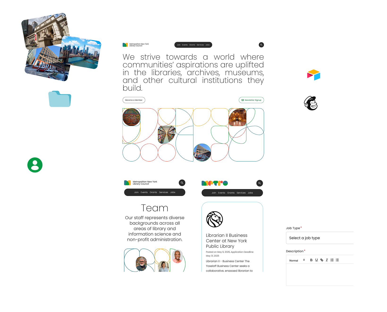
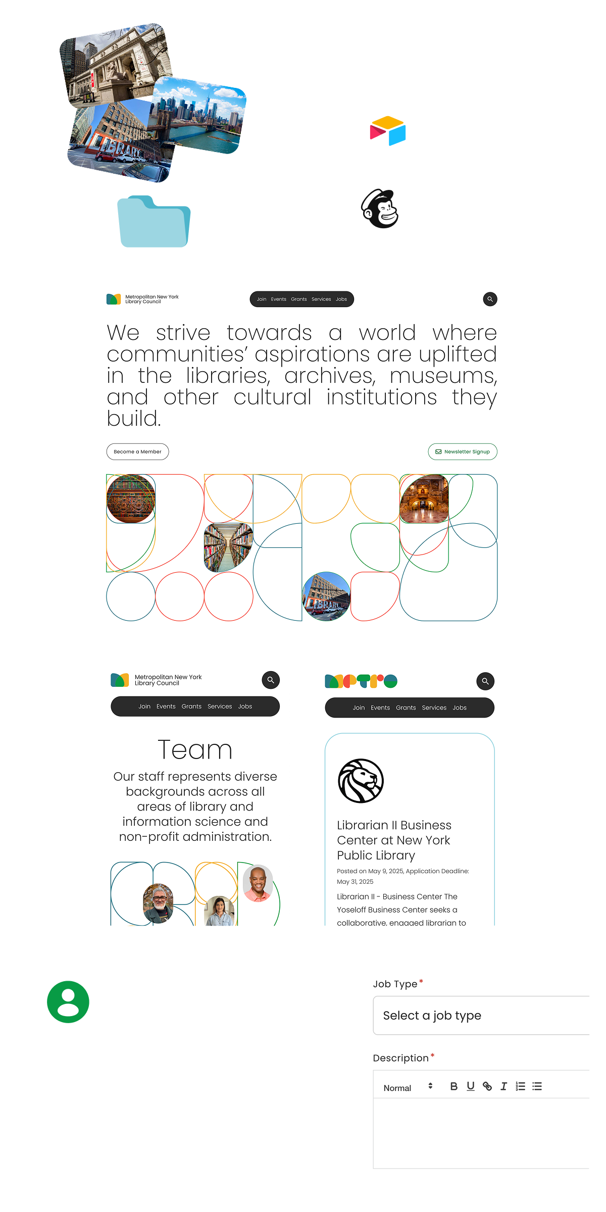
Froghouse explored generative patterning as a way to reinforce the dynamic and diverse nature of the work. This led to developing a series community-centered workflows in which staff and partners can contribute photos to the homepage patterns and develop unique marks for themselves and their projects from a common set of brand elements.
The pattern shapes can be endlessly recomposed to create unique marks for events and programs which remain recognizably METRO.